May 19, 2026 · Bella Staging
Color Trends 2026: How to Use Color Psychology to Stage Homes That Sell
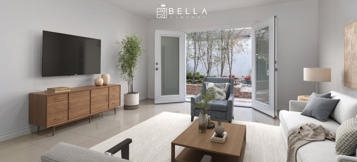
Every buyer who walks through a listing — or scrolls through photos online — is making an emotional decision. And nothing triggers emotion faster than color. The right palette can make a space feel warm and inviting in seconds. The wrong one can send a buyer clicking away before they ever read the listing price.
In 2026, color trends in home staging have shifted in a meaningful direction: away from the stark whites and grays that dominated the last decade, and toward warm, grounded, nature-inspired palettes that feel livable and emotionally resonant. At Bella Virtual Staging, we're seeing these shifts play out in every market we work in — from Toronto condos to LA estates to Miami vacation properties.
This guide breaks down the top 2026 color palette trends for home staging, explains the psychology behind why they work, and shows you exactly how to apply them room by room.
Why color psychology matters in home staging
Color psychology is the study of how colors influence human mood and behavior. In a staging context, it's one of the most powerful — and most underused — tools a real estate professional has.
Consider this: according to the National Association of Realtors, staged homes sell faster and at higher prices than their unstaged counterparts. But staging isn't just about furniture placement. Color sets the emotional tone before a buyer has taken a single step inside.
- Warm tones (creams, terracottas, warm whites) signal comfort, security, and belonging — the feeling of "home."
- Cool tones (soft blues, sage greens, misty grays) evoke calm, cleanliness, and spaciousness.
- Neutral earthy tones (clay, linen, warm taupe) feel grounded and timeless — they don't polarize buyers.
- Accent colors (deep forest green, muted gold, dusty rose) create visual interest without overwhelming a space.
The goal is to create a palette that makes the majority of buyers feel comfortable and emotionally drawn to a space — not one that reflects the current owner's personal taste.
The top home staging color palette trends for 2026
This year's leading color directions are unified by one theme: warmth grounded in nature. Buyers are seeking spaces that feel like a refuge — from the pace of work, from uncertainty, from the digital world. Color is the fastest way to communicate that feeling.
1. Warm terracotta and adobe clay
Earthy reds and burnt oranges are having a major moment in 2026. Used as an accent wall, in soft furnishings, or in ceramic decorative pieces, terracotta tones evoke warmth, groundedness, and a subtle Mediterranean quality that photographs beautifully. Pair with cream walls and natural linen textiles for a cohesive, magazine-worthy look.
Best used in: Living rooms, dining rooms, entryways
2. Sage green and soft moss
Sage has evolved from a trend into a staple. In 2026, it's appearing in deeper, more saturated forms — moving toward soft moss and eucalyptus. Green connects buyers to nature psychologically, lowers heart rate, and makes a space feel fresh without being cold. It works especially well in kitchens and bathrooms, where buyers want to feel calm and clean.
Best used in: Kitchens, primary bathrooms, home offices
3. Warm linen and buttery cream
The era of stark white walls is giving way to warm off-whites — think linen, antique cream, and barely-there butter yellow. These tones read as neutral but add a softness that pure white lacks. They also photograph warmer, which is crucial for online listings where lighting can make white walls look sterile or blue-tinted.
Best used in: Bedrooms, hallways, open-plan living areas
4. Rich caramel and warm taupe
Medium-depth browns and warm taupes are replacing the cool grays that defined the 2010s. These tones feel sophisticated and timeless — they pair effortlessly with natural wood, brass hardware, and soft textiles. In a virtually staged space, this palette signals "move-in ready luxury" without feeling pretentious.
Best used in: Primary bedrooms, studies, luxury living rooms
5. Coastal blue and misty slate
For properties near water — or any listing trying to evoke a relaxed lifestyle — soft coastal blues and misty slate tones remain powerful in 2026. These shades are aspirational without being bold, which keeps them broad enough to appeal to a wide buyer pool. Pair with warm wood tones to avoid the space feeling cold.
Best used in: Guest bedrooms, bathrooms, vacation properties
Room-by-room color staging strategy
Knowing the trends is one thing. Applying them strategically — room by room — is where staging professionals create real value.
Living room
The living room is where buyers imagine their life in the home. Use warm, welcoming tones: a cream or warm linen base with terracotta or caramel accents in cushions, a rug, or a statement chair. Avoid anything too bright or polarizing. The goal is universal comfort.
Kitchen
Buyers want kitchens that feel clean and fresh. Sage green or soft moss cabinetry (even virtually applied) is performing exceptionally well in 2026 — it reads as both modern and warm. Pair with warm white walls and brass or matte black hardware for a high-end feel.
Primary bedroom
This is the sanctuary space. Lean into the warmest, most serene tones in your palette — warm taupe, dusty blush, or a deep, muted sage. Avoid anything too stimulating. The goal is to help buyers feel deeply relaxed the moment they step into the photo.
Bathrooms
Soft coastal blue or sage green work beautifully in bathrooms. Pair with white fixtures and warm wood or bamboo accents for a spa-like feel. Even in a small bathroom, these tones make the space feel intentional and elevated.
Home office
With remote and hybrid work now embedded in buyer expectations, the home office is more important than ever. Deep sage, warm navy, or rich caramel create a focused yet comfortable environment. Avoid stark white — it reads as unfinished in photos.
How virtual staging makes 2026 color trends accessible for every listing
One of the greatest challenges in traditional physical staging is the cost and logistics of implementing on-trend colors — especially when a property is occupied, or when a seller is working with a tight budget.
Virtual staging solves this completely. With Bella's virtual staging service, we can apply any 2026 color palette — including paint colors, furniture, rugs, soft furnishings, and decor — to a property's existing photos in 24–48 hours. Every color decision we make is intentional and informed by both current design trends and the psychology of the target buyer demographic.
The result: listing photos that feel fresh, current, and emotionally compelling — without the cost or disruption of physical renovation.
See how this works in our realtor case studies and explore trending palettes in our staging lookbook.
Common color staging mistakes to avoid in 2026
- Going too bold with accent walls. A deep accent wall can work, but only when balanced carefully. In a small space or a poorly lit photo, it shrinks the room visually.
- Mixing warm and cool tones without intent. Cool gray furniture against warm terracotta walls creates visual tension that buyers sense even if they can't name it. Pick a temperature and commit.
- Using pure white as a default. Stark white reads as cold and unfinished in most lighting conditions. Replace it with a warm off-white or linen tone.
- Ignoring the listing photos' lighting temperature. A color that looks warm in person can photograph differently depending on the light. In virtual staging, we account for each photo's specific lighting to ensure colors render as intended.
- Staging for personal taste instead of mass appeal. The goal is to maximize the number of buyers who feel at home in the space — not to impress design editors. Broad, warm, livable palettes almost always outperform bold personal statements in a sales context.
Frequently asked questions
What are the best paint colors to sell a home in 2026?
Warm off-whites, soft sage greens, warm taupe, and terracotta accents are the top-performing colors in 2026 home staging. These tones appeal to the broadest range of buyers and photograph warmly in listing photos.
Does color really affect how fast a home sells?
Yes. Color is one of the first things buyers register — consciously or unconsciously — when viewing a listing. Spaces staged in warm, psychologically inviting palettes consistently generate more showing requests and stronger emotional responses from buyers.
Can virtual staging change paint colors and decor in existing listing photos?
Absolutely. Bella's virtual staging service can digitally update wall colors, flooring tones, furniture, and accessories in any existing photo. This means any property — occupied or vacant — can be presented with a fully on-trend 2026 color palette.
How do I choose the right color palette for my specific listing?
The best palette depends on the property type, target buyer demographic, architectural style, and local market. Our staging team evaluates all of these factors when selecting colors for each project — which is why our staged listings consistently outperform generic templates.